ReportBuilder - Customized Reporting
ReportBuilder - Creating and Editing Custom Reports
Don't see ReportBuilder in Martus? ReportBuilder is available as an upgrade to your Martus subscription. For information about pricing and implementation, create a ticket through the Knowledge Base if you are a direct Martus customer, or contact your Martus reseller if you are supported by a Martus partner.
ReportBuilder is Martus' custom report writer. Admins, and non-admins with rights to ReportBuilder, can create, copy, and share reports. Admins can also un-share reports owned by other users. Available sources for ReportBuilder reports include actuals and budgets only. ReportBuilder cannot be used to create balance sheet or cashflow statements of any kind.
Non-admins can only view data permitted per their dimension restrictions. Formulas may not work as expected and rows may be hidden if the user cannot access the data.Navigating the ReportBuilder Page
In Dashboard > ReportBuilder, you'll see a listing of reports, sorted alphabetically in 3 sections: User, Shared and Templates.
- User reports have been created by the logged in user.
- Shared reports have been shared with all users who can access ReportBuilder. Non-admin users will view shared reports with their Martus dimension restrictions. Note that Notes columns in shared reports are collaborative, and any user that can access the shared report can change the notes.
- Templates are pre-loaded by Martus, and can be copied, but not edited.
- Click Add New to create a new report based on a default template.

Navigating the Report Page
When you click a report, the report will load in View Mode.
There are several actions available.
- Cancel - Return to Dashboard > ReportBuilder.
- Settings - View and edit the settings for this report. Click to find detailed information on Settings.
- Full Refresh - Refresh the report and data.
- Save As - Make a copy of this report.
- Edit Mode - Click to edit the report.
- Export - Export the report directly to Excel (.xlsx) or PDF, or choose to email the report to selected recipients. Currently, only tabular sections will export. Charts and KPI's will not export.
- Share Status - The left (Private Report/Shared Report) indicates the status of the report; the right button (Share/Unshare) indicates the option to change the share status.
- Owner - The report owner's name is also displayed.
- Save Notes - Notes columns are collaborative between users. Any user with rights to ReportBuilder can enter notes on a shared report for which they have access. Click Save Notes to save the updated notes entered on a shared report.

Creating and Sharing Reports
You can create a new report, copy a template, or copy another report.
To create a new report:
- In Dashboard > ReportBuilder, click Add New.
- Enter the report name and click OK.
- A new report is created with a default section to get you started.
To copy a template:
- In Dashboard > ReportBuilder, click on a template.
- Click Save As.
- Enter the new report name and click OK.
- A new report is created, with the same settings, sections, columns and rows.
To copy a report, whether owned or shared:
- In Dashboard > ReportBuilder, click on a report.
- Click Save As.
- Enter the new report name and click OK.
- A new report is created, with the same settings, sections, columns and rows.
To share or unshare a report:
- In Dashboard > ReportBuilder, click on a report.
- Click Edit Mode.
- Select or unselect the Share checkbox.
- Click Okay to share the report or cancel to return.
Note: Admin users have the ability to edit and unshare shared reports.
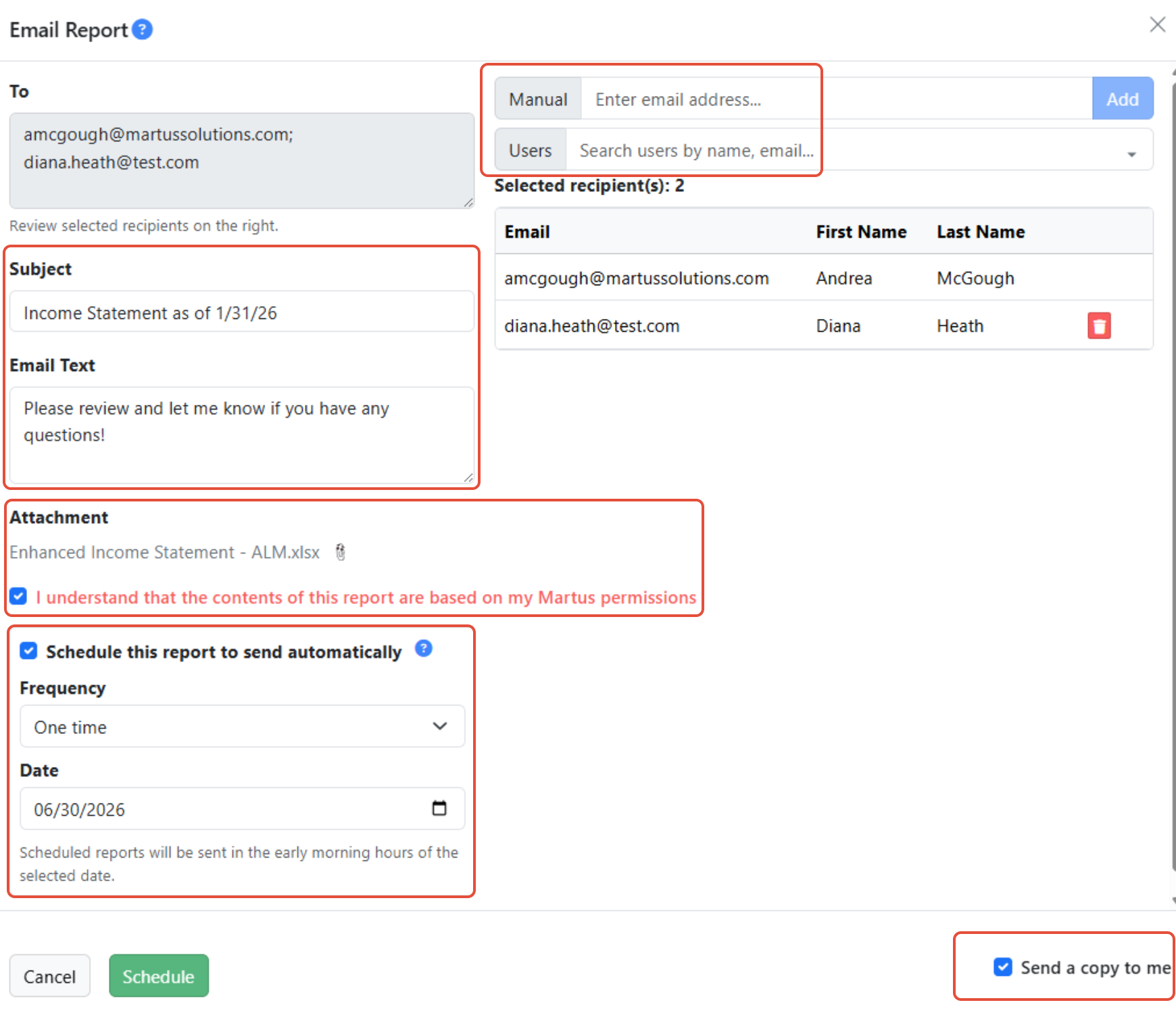
Emailing Reports to Selected Recipients
You can email a report, in Excel (.xlsx) or PDF format, to Martus users and others of your choosing. Any Martus user can email reports from ReportBuilder. Any report can be scheduled to be sent. Schedules can be managed by a Martus Admin in Admin Reports > Scheduled Email Reports.

Steps to Email ReportBuilder Reports
- Manually enter email addresses one at a time and click Add, or select from the available Martus users using the fields to the right.
- Add the Subject and Email Text.
- Verify the correct Attachment is show below the Email Text.
- Choose to send a copy to yourself by checking the box in the lower right.
- Check the box 'I understand that the contents of this report are based on my Martus permissions' to verify that the contents of the report may contain sensitive information not appropriate for specific recipients. You must click this box to activate the Send button.
- If desired, schedule the report to send automatically. Choose the Frequency (One time, Daily, Weekly or Monthly) and other parameters.
- Click Send to send the attachment and email to the recipients.
Navigating Edit Mode
In Edit Mode, you can change the report, save it, share it, and delete it.

Each report has its own settings. Some of the settings apply to the entire report, and others are defaults that can be overridden at the section, column or row level. If you copy a report or template, the Settings are also copied to the new report. Click to find detailed information on Settings.
Each report is made up of sections. A tabular section contains columns and rows; a charts section contains charts and graphs; and a KPI section contains KPI cards. Click to find detailed information on Sections, Columns, Rows, and Charts and KPIs.
Each section, row, column, chart and KPI card can be edited using the pencil icons.

ReportBuilder Notes:
- Reports within ReportBuilder will always export to one tab in Excel or one page if exporting to PDF.
- ReportBuilder is very flexible, allowing for a variety of ways columns and rows are structured. It is possible to pivot the report to have dimensions on the rows. Months and date ranges will always appear as columns.
- A user cannot save changes to a report they do not own. Make a copy using Save As.
- Put any report or template into Edit Mode to view or update/refresh the settings for any column, row, section, chart or KPI card. Changes cannot be saved, however, unless the user is the owner.
The ReportBuilder Assistant
Would you like to be able to type in a text description of the report you want to see? We have created the new ReportBuilder Assistant to help streamline your report-building experience. It's AI assisted, and knows the Martus terminology related to ReportBuilder.
ReportBuilder Assistant Consent
- Navigate to the Support page in Martus.
- Enable the Assistant by clicking OK in the RB Assistant Consent box. Only one Admin user needs to complete this step on behalf of your organization.

Click Withdraw to remove consent.

Access the ReportBuilder Assistant
- Navigate to Dashboard > ReportBuilder.
- Click Add New or open an existing report.
- Click Edit Mode.
- Click ReportBuilder Assistant.

- In the Report Generation prompt, type in the text description for the report that you would like ReportBuilder to create for you and click Generate.

Here is an example, and the report that was generated.

And then, I tweaked it just a bit!

Current Limitations of the ReportBuilder Assistant
- No style or formatting options
- No formulas across sub-rows (e.g., “Add up all utility accounts”)
- Cannot edit an existing report (e.g., “Add a row to this report”)
- Each prompt creates a new report — revise and rerun if needed
- Changes are not saved unless you click Save
Tips for Using ReportBuilder Assistant
Prompts work best when you:
- Include key details like actuals or budget, period, and column type
- Use Martus/ReportBuilder terminology (e.g., row and column names, budget names like “current year”)
- Indicate the type of filter you want to use, for example, saying 'filter to Communications' won't work as well as 'filter to the Department of Communications'
- Write in full sentences, for example: “Create a report comparing last year’s budget to next year’s budget."
Things That Might Not Work As Well (But You Can Try)
- Vague prompts like “What’s my budget this year?”
- Generic terms like “Add a column” or “budget” with no year
- Incomplete phrases like “Next year's budget” or “Actuals only”
Still feeling stuck?
Click here to review more Examples.
ReportBuilder - Report Settings
Report Settings apply to the specific report you have open. Some of the settings apply to the entire report, and others are defaults that can be overridden at the section, column or row level. If you copy a report or template, the Settings are also copied to the new report.
Each setting is explained below.
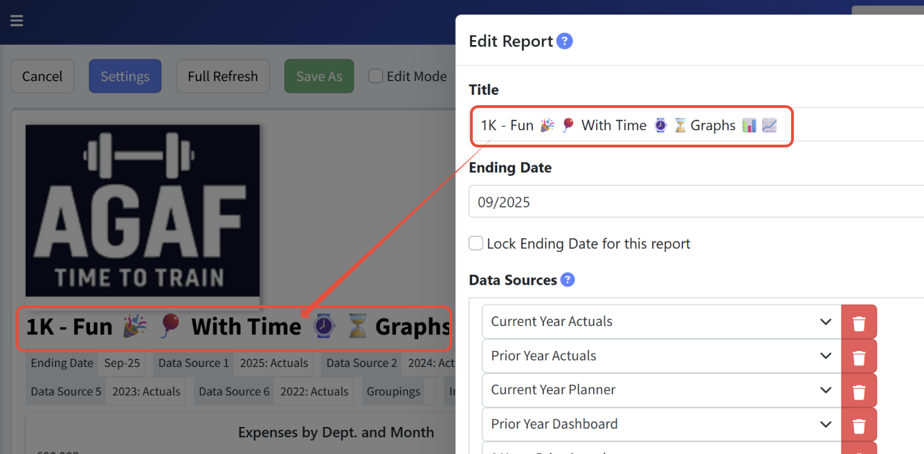
Title
Title must be a unique name for the report. If you are copying another report or template, consider adding your initials to the name.

Ending Date
Ending Date defaults to the Default Month set in Setup > Calendar. It can be changed while you are editing or viewing the report, but once you click Save on any screen or leave ReportBuilder and return, the Ending Date will reset to the Default Month.
To lock the Ending Date for the report - and override the Default Month - enter the preferred Ending Date, and then click Lock Ending Date for this report. The Ending Date will not change, and a lock icon will appear next to the Ending Date shown on the report indicating the date is locked.


Data Sources
Specify all of the data sources to be used anywhere on this report. Choose any budgets or actuals that exist in Martus. Select dynamic data sources like "Current Year Actuals" or "Prior Year Planner", for reports that you want to use in future years. Select static data sources for specific years and specific budgets, for example for comparing multiple budgets and reforecasts for a specific year.

Groupings
Set your default groupings in Settings. Data on rows can be grouped by any combination of account, account category, and dimensions configured in Martus. These groupings can be overridden at the section and row levels.
Grouping Options
Select one or more default groupings based on different type options, and how those groupings are displayed.
- Type:
- Account - Displays a row per account by default.
- Account Category - Display rows based on Account Categories by default. The number of levels is dependent on the display type selected.
- Dimensions - Options will vary depending on your system's configuration. Displays rows based on the specified dimensions by default. The number of levels is dependent on the display type selected.

- Display type:
- Rollup - Shows the total for a parent and all its children, followed by separate lines for each dimension value. If desired, select a Level to display the hierarchy within a dimension to the specified level.
- Expand - Provides a line for the parent and all child dimensions, followed by a total for the parent dimension.
- Flat - Values are shown for all dimension values regardless of whether they are parents or children. Hyperlinks for drilldown are shown on amounts on rows that are displayed by account and set to the flat level of detail.

Num Format
Select the default number format for the report. This can also be specified at the row and column levels.
These options are available for presenting numbers:
- Negative Sign - Uses a negative sign with a negative number.
- Percent - Adds a percent sign to a number.
- Cents - Displays the number with two decimal places.
- Parenthesis - Displays a negative number in parentheses.

Dimensions
Specify dimensions to filter the data for the entire report. Dimensions shown are specific to your instance of Martus.

Category
Select an Account Category to filter the data for the entire report. Categories available are specific to your instance of Martus.

Reporting Group
Select a Reporting Group to filter data for the entire report. Reporting groups available are specific to your instance of Martus. When using reporting groups, drilldown hyperlinks will be disabled.

Show Logo
Click Show Logo to add your logo to the top left corner of the report. Logos are uploaded to Martus in Setup > Branding.

Excluded
Click Excluded to to include excluded accounts and dimensions on this report. This box is only shown to Martus Admin users and those non-admins with permission to see excluded data.

Styles
Use Styles to format your report. Specify font size, bolding, and italics, as well as alignment, font color and background color. Then, apply these styles to sections, rows and columns within the report. Add additional styles if desired.

Show Totals
These selections control how totals are presented for the selected groupings.
- --Show Totals--: Displays parent/child relationships with totals rolled up at the top
- Is Show Totals: Displays parent/child relationships with the totals rolled up at the bottom
- Not Show Totals: Displays the option to expand/collapse parent/child relationships

Report Setting Actions
The actions menu appears at the bottom of the Edit Report modal.
- Cancel - Leave without saving changes.
- Update - Update the report without saving changes.
- Update and Refresh - Update the report and data without saving changes.
- Save - Update the report and data, and reset the Ending Date to the Default Month, and save all changes.

ReportBuilder - Section Settings
Within ReportBuilder, each report will have at least one section, and can have as many as sections as needed. There are three section types available - tabular, chart, and KBI. Each section has its own settings, and sections can be copied and edited. While all sections will export to the same page, this method does create the ability to nest various types of reports with different rows and columns into the same report.
Non-admins can only view data permitted per their dimension restrictions. Formulas may not work as expected and rows may be hidden if the user cannot access the data.Each setting is explained below.
Type
Type indicates the type of section. Note that once the section type is set and an element (row, column, chart, etc.) has been added to the section, the Type cannot be changed.
- Tabular Section - Contains rows and columns of data. Each tabular section within a report has its own set of columns and rows, and can be based on different data sources. Formulas may be used within sections but can not reference other sections.
- Chart Section - Contains various chart options to display data based on the data sources included within the Settings for the report.
- KPI Section - Contains KPI cards based on one or more Tabular sections. All KPIs require at least one tabular section from which to reference data.

Title
Enter an optional title for the section. It displays in Edit Mode for all three section types, and also displays in View Mode for Tabular sections.

Reporting Group
This filter will be applied to all rows and columns in the section. Drilldown hyperlinks are disabled when using Reporting Groups. Note: Reporting Groups are only available to the Plus and above subscription levels.

Hide
This will hide the entire section and is often used for tabular sections that KPIs are referring to but that should not be shown in View Mode.

Show Expenses as Negative
Check this box to see expense accounts as negative numbers. The default is unchecked, to show the expenses as positive numbers in the report.
Only the Income Statement Layout row option and Account Type row option will show expenses as positive numbers. The Gain/Loss layout will always show expenses as negative.
Style
This is the Style used for the section. You can leave it unselected, or choose a specific style for the section that changes the detail lines in the report. Other rows and their styles are not affected.

Section
Copy the layout of another section.

Section Setting Actions
The actions menu appears at the bottom of the Edit Section modal.
- Add Section Above - Insert a new section above the selected one.
- Add Section Below - Insert a new section below the selected one.
- Add Col Right - Insert a new column.
- Add Row Below - Insert a new row at the top of the section.
- Copy - Make a copy of the current section.
- Cancel - Leave without saving any changes.
- Update - Update the report, but do not refresh the data or save the changes.
- Update and Refresh - Update the report and refresh the data, but do not save the changes.
- Save - Update the report and refresh the data, and save the changes.
- Remove - Remove the current column.

ReportBuilder - Column Settings
A column in ReportBuilder may present data based on a source, display text or add space between other columns. The list of options that you can set depends on the Column Type that you choose. For all types of column except Separator and Notes, you'll be able to set the data source and optional header(s), along with the number format and color for negative values. If desired, you can also select an alternate Style.
*columns can be dragged and dropped to re-order them on the report.
Non-admins can only view data permitted per their dimension restrictions. Formulas may not work as expected and rows may be hidden if the user cannot access the data.Each setting is explained below.
Column Type
Column type descriptions are available in the dropdown. They include:
- Dimension Comparison - This displays a group of four columns per dimension value. The four columns show two different data sources, and the difference and different percent between them.
- Dimensions - This provides a group of columns based on dimension values. You can choose the dimension (from a list of all dimensions that you use in Martus), and you can indicate whether you want to roll these up (see totals at the parent levels only). If you don't choose to roll up, then a column is shown for every dimension value that has values.
- Flex Value - Used to store a value on each row, often used in a formula in another column. Select a default value and/or use overrides for specific rows.
- Formula - For formula columns, specify the calculation using rows, columns and operators.
- Notes - The Notes column type allows you to enter notes on each line of the report. Notes are collaborative between users. This means that any user with rights to ReportBuilder can enter notes on a shared report for which they have access. Click Save Notes to save notes entered on a shared report.
- Period - This will provide a single column summarizing data based on the Period setting that you choose; see the list of Period values below.
- Period Comparison - This provides one block of four columns that include two data sources: Data Source 1, Data Source 2, the difference between the columns (ABS(Data Source 1) - ABS(Data Source 2)), and the percentage difference (dividing the difference by the amount of the first data source). See the list below for Period values that can be applied to a Period Comparison.
- Period Group - This will provide a group of one or more columns based on the Period setting that you assign; see the list of Period values below that can be used for Period Groups.
- Separator - This shaded column is used to separate different sections of the report.
- Title - This column type is useful for the row titles typically shown on the left side of your reports.

Header
A header can be used to shorten or override an existing default header, or create one when a default isn't available.
- For any column of type Period or Period Group, there is a default heading based on the name and year of the data source. Enter different heading text if desired.
- For Period Comparison columns, there are default headings for each of the four columns in the block. Enter different heading text for each of the four columns if desired.
- For Formula columns, there is no default heading. A heading is therefore required for these columns in order to identify the information being presented.

These options are available for presenting numbers.
- Negative Sign - Uses a negative sign with a negative number.
- Percent - Adds a percent sign to a number.
- Cents - Displays the number with two decimal places.
- Parenthesis - Displays a negative number in parentheses.

Select the data source(s) for this column. Choose any data source available via the report's Settings. If the data source is not listed, update Settings first, then create or update the column.

Reporting Group
Select a Reporting Group to filter the column.
- Reporting groups are only available at the Plus and Premium subscription levels.
- Reporting groups can be used as a filter at the Settings level, and on individual sections, columns and rows. The lowest level filter applies if you use a reporting group at multiple levels.
- Drilldown hyperlinks are disabled for this section while filtering by reporting group.

Negative Red
The Negative Red setting controls whether negative numbers are shown in red in the report.

Style
Use the default style (none selected), or select an alternate style. The default column style does not override the row style, allowing it to take precedence, but a custom column style may override the row style. The Separator Column style is primarily used to set the color on separator columns in the report.

Hidden
This setting controls whether the column is hidden when in View Mode. Hidden columns are always displayed in Edit Mode.

Formula Intersection
When using the column type Formula, select the condition desired when both a formula row and a column row intersect.
- Row Formula Overrides - The row formula takes precedence and the column formula is ignored.
- Column Formula Overrides - The column formula takes precedence and the row formula is ignored.

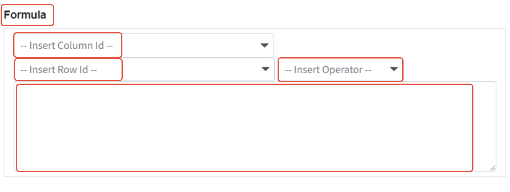
Formula
When using the column type Formula , use the row, column and operator dropdowns to create the formula.

Dimension & Rollup
This provides a group of columns based on dimension values when using the Dimension type. Choose the dimension (from a list of all dimensions in Martus), and indicate whether to roll these up (i.e., see totals at the parent levels only). If you don't choose to Rollup, then a column is shown for every dimension value that has values.

Period
Different periods are available depending on the Column Type selected. A detailed list is below.

Period Column Type
Choose one of these Periods:
- Annual (Total) - A single column for the entire year
- YTD (Total) - Totals through the Ending Date for this report
- YTD Remaining (Total) - Totals for months after the Ending Date through the end of the fiscal year
- Ending date - Totals for the month that is identified by the Ending Date for this report
- Months 1 through 12 - Totals for the specified month
- Quarters 1 through 4 - Totals for the selected quarter
Period Group Column Type
Choose one of these Periods:
- Annual (Months) - Twelve columns, one for each month of the year
- YTD (Months) - Individual columns for each month through the Ending Date
- YTD (Quarters) - Individual columns for each completed quarter through the Ending Date
- YTD Remaining (Months) - Individual columns for each month following the Ending Date until the end of the fiscal year
- YTD Remaining (Quarters) - Individual columns for each remaining full quarter
Period Comparison Column Type
Choose any one of these Periods to create the desired comparison block:
- Annual (Months) - A single comparison block for the entire year, for each data source
- YTD (Months) - A block for each month through the Ending Date for this report, showing the total for each data source
- YTD (Quarters) - A block for each completed quarter through the Ending Date for this report, showing the total for each data source
- YTD Remaining (Months) - A block for the each month after the Ending Date through the end of the fiscal year
- YTD Remaining (Quarters) - A block for the each full quarter after the Ending Date through the end of the fiscal year
- Annual (Total) -
- YTD (Total) - A block that shows totals through the Ending Date for this report
- YTD Remaining (Total)- A block that shows totals through the Ending Date for this report for the months after the Ending Date through the end of the fiscal year
- Ending Date - A comparison block for the month that is identified by the Ending Date for this report
- Months 1 through 12 - A comparison block for this specific month
- Quarters 1 through 4 - A comparison block for the selected quarter
Column Setting Actions
The actions menu appears at the bottom of the Edit Row modal.
- Add Col Left- Add a separator column to the left of the current column.
- Add Col Right - Add a separator column to the right of the current column.
- Copy - Make a copy of the current column.
- Cancel - Leave without saving any changes.
- Update - Update the report, but do not refresh the data or save the changes.
- Update and Refresh - Update the report and refresh the data, but do not save the changes.
- Save - Update the report and refresh the data, and save the changes.
- Remove - Remove the current column.

ReportBuilder - Row Settings
A row within a Tabular Section in ReportBuilder can include rows of data, formulas, or notes. The list of options that you can set depends on the Row Type that you choose. For most types of rows, you can choose a title, the number format, and a reporting group filter as well as an alternate style. For Income Stmt Layout, Account Type, and Gain/Loss rows, you can also choose the type and levels of Groupings for the row. Hyperlinks for drilldown are shown on amounts on rows that are displayed by account and set to the flat level of detail. Expense and revenue lines are sorted alphabetically.
*unlike columns, rows cannot be dragged and dropped to re-order them on the report.
Non-admins can only view data permitted per their dimension restrictions. Formulas may not work as expected and rows may be hidden if the user cannot access the data.Each setting is explained below.
Row Type
Row-type descriptions are available in the dropdown. All rows within each type will be listed in descending alphabetic order. They include:
- Account Type - Select one or more account types (Income, Expense, Stats, etc) to show sections for only that account type within this row. Note: This is the only row type that will display Stat accounts.
- Formula - Use this to create a formula for this row.
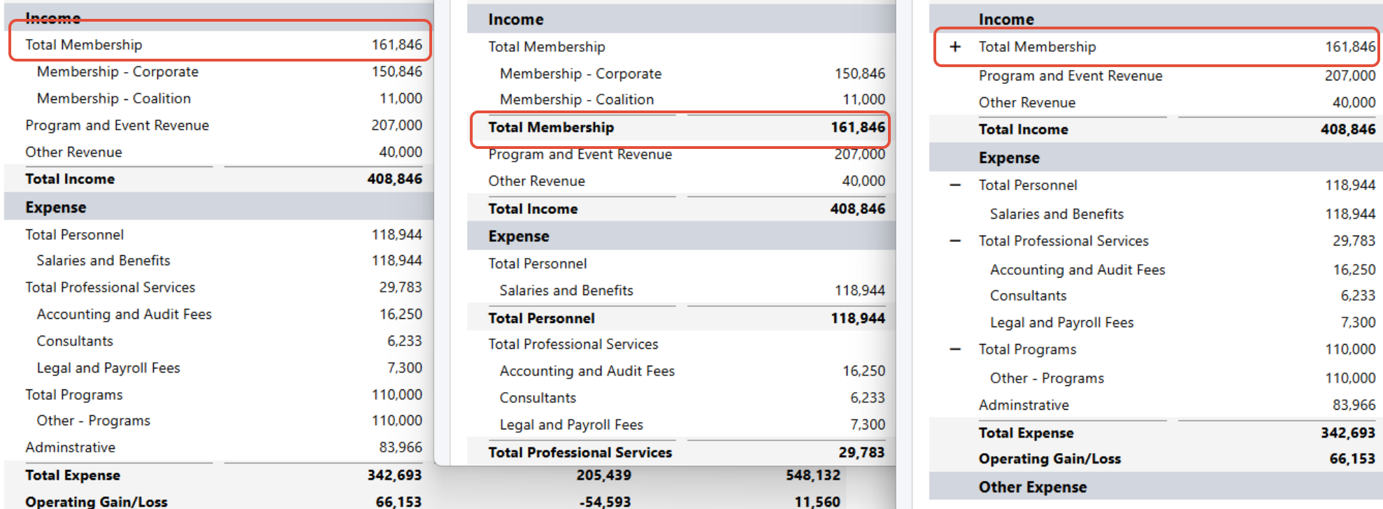
- Gain/Loss Layout - Use this to show a net total by Dimension or Account Category for all account types on the row. This row type will display Expenses as negative numbers.
- Income Stmt Layout - Use this to include the following account types, Income, Expense COGS, Other Income, and Other Expense accounts in an Income Statement format. This layout will show Expense accounts as positive numbers IF the Section is set to show Negatives as Positives. Note: You cannot select an alternate Style when using this layout.
- Text Row - Enter text to display on the row. Leave blank to create a separator row.

Title
A title can be used to add context to what the rows are displaying.
- For Account Type, Gain/Loss, and Text Rows, the Title is optional as Martus will display the title of the dimension or account grouping selected below.
- For Formula rows, the Title is Required.

Num Format
These options are available for presenting numbers:
- Negative Sign - Uses a negative sign with a negative number.
- Percent - Adds a percent sign to a number.
- Cents - Displays the number with two decimal places.
- Parenthesis - Displays a negative number in parentheses.
Hidden
This setting controls whether the entire row is hidden when in View Mode. Hidden rows are always displayed in Edit Mode.

Style
Use the default style (none selected), or select an alternate row style. Any row style overrides the default column style, but a custom column style will override the row style. Note: You cannot select an alternate row style when using the Income Stmt Layout.
When using the row type Account Type, you will be given the option to select the Type. Within the Row you will still have the ability to group the types selected.

Formula
When using the row type Formula, use the row, column, and operator dropdowns to create the formula.
Groupings
Income Statement Layout, Account Type, and Gain/Loss Layout row types allow for various groupings. Groupings applied to the row will override groupings applied to the report via the Settings option. All values within each grouping type will be sorted alphabetically. Grouping options include accounts, account categories, and dimensions. Any unused values on rows will be hidden from all users.
Grouping Options
There are multiple grouping options. These are the same options as available within the Settings menu.
- Grouping type: This option overrides the Groupings set on the Settings menu. The following are the available Grouping Options.
- Account - Displays a row per account.
- Account Category - Display rows of accounts grouped by Account Categories. (Note: All Account Categories are displayed, so this is not considered a filter to a specific Account Category. Create a Reporting Group based on an Account Category to filter to specific Account Categories.) The number of levels is dependent on the display type selected.
- Account Type - Displays the row with Income and Expense groupings when using the Gain/Loss Layout to provide sub-totals.
- Dimensions - Options will vary depending on your system's configuration. Displays rows based on the specified dimension such as Department or Project. The number of levels is dependent on the display type selected.

- Display type: This setting controls how much detail will be shown for nested (parent/child) relationships within Dimensions and Account Categories.
- Rollup - Shows the total for a parent and all its children, followed by separate lines for each dimension value. If desired, select a Level to display the hierarchy within a dimension to the specified level.
- Expand - Provides a line for the parent and all child dimensions, followed by a total for the parent dimension.
- Flat - Values are shown for all dimension values regardless of whether they are parents or children. Hyperlinks for drilldown are shown on amounts on rows that are displayed by account and set to the flat level of detail.

Reporting Group
Select a Reporting Group to filter the data on this row.

Row Setting Actions
The actions menu appears at the bottom of the Edit Row modal.
- Add Row Above - Add a blank row above the current row.
- Add Row Below - Add a blank row below the current row.
- Copy - Make a copy of the current row.
- Cancel - Leave without saving any changes.
- Update - Update the report, but do not refresh the data or save the changes.
- Update and Refresh - Update the report and refresh the data, but do not save the changes.
- Save - Update the report and refresh the data, and save the changes.
- Remove - Remove the current row.

Notes about Groupings
- Within each set of levels, values are sorted alphabetically. For example, if the rows are set to department with accounts as the next grouping, Martus will display all departments alphabetically, and under each department Martus will display all accounts alphabetically.
- The Account Category grouping inherits the sort order of the Account Categories page. This is the only grouping option that allows for a customized sort order.
- ReportBuilder rows cannot be set to months. To view data by month, use a Column option such as Period Group.
- Only rows with values will display, for example, if a certain dimension doesn't have values and rows are set to that dimension, that dimension value will not display.
- You can effectively filter a row by specific account categories by including the account categories in a reporting group, and then filter by that reporting Group.
ReportBuilder - Charts and KPIs
Charts and KPIs allow you to paint a bigger picture about your organization's financial health. Whether you want to highlight income, expenses, or your budget, you can utilize the various Charts and KPIs to help bring life to your reports.
Section Types
There are three section types: Tabular, Chart, and KPI. Each section within the report is designated to a specific type. It is possible to hide any section with a report so that you can utilize a Tabular section to define KPI values and not view the Tabular section on the finished report.
- Tabular - Standard report format with rows and columns specified by the row and column settings
- Chart - A chart section can contain one or more charts, based on the data sources specified in the overall Settings for the report. This section type IS NOT dependent on a Tabular section.
- KPI - Allows for various Key Performance Indicators to be added to the report on KPI cards. Each KPI can be a singular value or a comparison between two values. This section type IS dependent on having a Tabular section within the report, since each KPI is defined as a specific row/column on a Tabular report.
KPI Cards
KPI cards highlight one or two values to draw attention to key information. Each KPI card can show a red or green up or down arrow to indicate a favorable or unfavorable value or comparison. You can also choose to not show the arrow icon.
- Title - the title shown at the top of the KPI card
- Style - allows one of the styles from the report Settings to be assigned to the KPI value
- Value - identify the value by selecting a Tabular section and picking a row and column
- Comparison - to compare the value to another data point, select a Tabular section and pick a row and column to choose the specific cell for the comparison. The variance between the two values is is shown as a secondary, smaller number within the KPI card
- Comparison Text - the label for the variance
- Arrow Type - choose whether a positive difference is good or bad. For example, when you compare actual income to budgeted income, a positive number is good. But if you are comparing actual expense to budgeted expense, a positive value is bad. You can also choose to have no arrow icon shown at all.

Charts
The charts section allows for various types of charts. Each chart can be customized based on the data sources and other values specified in the report's Settings menu, the configuration of the chart, and the filters applied to the chart.
Chart Layout Options:
- Title: The title that will display above the chart
- Chart Type: Choose the chart type (pie, column, bar, etc.)
- Data Sources: Choose the desired source(s). These dropdowns will list the data sources specified on the Settings menu of the report
- Grouping: Determine how the chart should be segmented (options are accounts, account category and dimensions)
- Sub-grouping: Allows for segmenting by another level including months and quarters; the data source is the default sub-grouping
Chart Filter Options:
- Period: The time period to include
- Total Type: Select Expense, Income, or Gain Loss (Net)
- Dimension Filters: Allow for filtering to a specific dimension according to how your instance of Martus is configured
Chart Types
Bar – Excellent for comparing budget to actuals, budget to actuals to reforecast, or showing a single data source grouped by dimension, category, month or quarter
Chart notes: Data Source = Budget; Grouping 1 = Department; Grouping 2 = Quarters
Pie – Supports only one data source.

Chart notes: Data Source = Budget; Grouping 1 = Department
Columns – Compare multiple data sources or one data source and a secondary grouping

Chart notes: Data Source = Budget; Grouping 1 = Department; Grouping 2 = Quarters
Stacked Column – Note that this uses grouping and sub-grouping. Sub-grouping is especially useful for the Stacked Column and Stacked Column Percentage charts.

Chart notes: Data Source 1 = Budget; Data Source 2 = Actuals; Grouping 1 = Department; Grouping 2 = Quarters
Percent Stacked Column – Note that this uses grouping and sub-grouping. Sub-grouping is especially useful for the Stacked Column and Stacked Column Percentage charts.
 Chart notes: Data Source 1 = Budget; Data Source 2 = Actuals; Grouping 1 = Department; Grouping 2 = Quarters
Note: Charts and KPIs cannot currently be exported with the PDF or Spreadsheet option. It is possible to screenshot the charts and KPIs for use in external reporting.
ReportBuilder Assistant Examples
Here are some ReportBuilder Assistant examples and the reports it created!
Budget vs. Actual Comparison
Prompt: Show me YTD budget and YTD actuals and compare the two.

Try on your own: Compare my current year budget to next year's budget.
Things to consider: Does it work better if you use the budget names? Do you have a Planner/Dashboard budget set.
Row Grouping Options
Prompt: Show me YTD budget and YTD actuals and compare the two while showing me only the parent rows of my Departments. (Note: Department is a dimensions in the example system - use an appropriate dimension in your system)

Try on your own: Ask the ReportBuilder to show you just two levels of a dimension that includes 3 levels of parent/child relationships.
Things to consider: What dimensions in your system have multiple parent/child levels?
Filtering Options
Prompt: Please show me a comparison between this year's budget and actuals with the filter of my General Location.

Try on your own: Ask the ReportBuilder to filter to a reporting group on a row or column.
Things to consider: Are you using Reporting Groups?
ReportBuilder Video #1 - Introduction
The ReportBuilder is a powerful and easy-to-use tool. You can use the provided templates as guides, save and customize those templates, create your own reports from scratch, save the reports as user-specific or shared reports, create your own formulas, and use any combinations of budgets and actuals from any year.
ReportBuilder Video #2 - Templates and Customizations
This is the second in a series of videos about the Martus ReportBuilder.
The ReportBuilder allows you to create reports using any actuals or any budget, from any year.
The first video introduced you to the basic building blocks of the ReportBuilder: Settings, Data Sources, and Groups.
This video shows you
- Template reports that Martus provides with the ReportBuilder
- Learn how to customize these reports
- Learn how to create a report from scratch
ReportBuilder Video #3 - Sections and Hidden Rows & Columns
This is the third video in a series of videos about the Martus ReportBuilder.
In this video, we look at using sections and hiding rows & columns to create complex reports that pack a lot of information into an easily readable form.
The important takeaway is that sections don’t all have to have the same columns and can even make use of different data sources. And, sections also allow you to invert your expenses to show as positive numbers, just like the rest of Martus!

In this video we show:
- The difference between lines, rows, and sections
- How to create multi-section reports.
- How to manage the columns and rows in the different sections of a single report
ReportBuilder - Custom Formatting
Don't see ReportBuilder in your system? ReportBuilder is available as an upgrade to your Martus subscription. Have your Martus Admin contact Support to find out more.With ReportBuilder, it's easy to format reports to match your brand or to simply have information stand out. ReportBuilder allows for control of most row and column styles, and you can add your logo as well.
You can control font size, bolding, italics, and alignment. You can also set text and background colors. Then, apply these formats to:
- Header rows, headers and sub-headers for groupings, and total rows within the tabular display
- Formula rows
- Single columns
- Specific columns within a period comparison column type
Using a Logo
Upload your organization's logo in Setup > Branding. and use it on ReportBuilder reports. The logo will appear in the report's header row. Click here for information on uploading your logo to Martus.
Include Your Logo in Report Settings
- From within an open report, click on Settings.
- Check Show Logo.
- Click Save.

Default Row Style Formatting
Each kind of row within a report has been assigned a style based on its purpose. Each row style can be formatted as desired. The defaults for each are outlined below.

| Row Style | Bold | Italics | Font Size | Alignment | Text Color | Background Color |
| Report Title Row | Yes | No | 24 | Left | Black (#000000) | White (#ffffff) |
| Table Header Row | Yes | No | 14 | Left | Black (#000000) | Light Grey (#f4f4f4) |
| Row Title Row | Yes | No | Not Set | Left | Black (#000000) | White (#ffffff) |
| Account Type Header Row | Yes | No | 14 | Left | Black (#000000) | Med Grey (#d2d6de) |
| Grouping Subheader Row | Yes | No | Not Set | Left | Black (#000000) | Light Grey (#f4f4f4) |
| Totals Row | Yes | No | Not Set | Left | Black (#000000) | Light Grey (#f4f4f4) |
| Formula Row | No | No | Not Set | Left | Black (#000000) | Medium Grey (#d2d6de) |
Default Column Style Formatting
Currently, only the Separator Column column type within a report has been assigned a default style in Settings. This style can be formatted as desired. The default is outlined below.
By default, there's no style on other columns, so that the style of the row type takes precedence. If you apply a style to a column, that style will be applied to every row in the column, instead of the applicable row styles.

| Column Style | Bold | Italics | Font Size | Alignment | Text Color | Background Color |
| Separator Column | Not Set | Not Set | Not Set | Not Set | No Color Selected | Light Grey (#f4f4f4) |
Default Section Style Formatting
You can select a Style to be used for a section, or leave it unselected. If you choose a specific style for the section, it changes the detail lines in the report. Other rows and their styles are not affected.
For example, you can create a style that specifies the font is italics and the font size is 11, and your detail lines will be formatted as such.

Editing Style Formats
- Go to Dashboard > ReportBuilder.
- Open any report and click Settings.
- Scroll down toward the bottom.
- Click Edit (pencil icon) next to the style you want to edit.

- Choose the appropriate options as desired.
- Click Save.
- Click Update and Refresh.
Adding a New Style to a Report
- Go to Dashboard > ReportBuilder.
- Open any report and click Settings.
- Scroll to the Styles section.
- Click Add Style.

- Update the style as desired and click Save.
- Use the custom style on rows or columns as desired.
Apply Formatting to Specific Rows
You can change the style on row types that are set to Account Type, Formula, and Gain/Loss Layout. You cannot change the row style on the Income Stmt Layout, except as part of a Section style selection.
- Click Edit Mode at the top of a report.
- On the row you'd like to edit, click Edit (pencil icon).
- Use the Style dropdown to choose the style you would like to apply.
- Click Update and Refresh or Save.

Apply Formatting to Specific Columns
You can change the style on all column types. Period Comparison columns allow you to use 4 different styles, one for each column in the comparison (see below).
- Click Edit Mode at the top of a report.
- On the column you'd like to edit, click Edit (pencil icon).
- Use the Style dropdown to choose the style you would like to apply.
- Click Update and Refresh or Save.

For Period Comparison columns, there are style dropdowns for each column in the comparison.

Example of a different style assigned to the Diff columns in a Period Comparison:

Notes
- Styles are controlled at the individual report level. When you copy a report or save it as a different name, the styles associated with it are also copied.
- The base style used for detail data lines cannot be changed, except as part of a Section style selection.
- Conditional formatting is not yet available, but Martus is considering this as as future potential enhancement.
Formatted Report Examples


ReportBuilder Hacks Using Formulas - and other fun things!
General Hacks
- Where you would use AND, use && instead.
- Where you would use OR, use || instead.
Rounding Numbers
Create the report as you want it, and then insert a formula column to do the rounding. When using the the ROUND function, set the Num Format to Cents if you want to see decimal places, or to Negative Sign if you don't want decimal places.
- To round to hundreds: Round(([reference lines])/100)*100
- To round to thousands: Round(([reference lines])/1000)*1000
Rounding Examples:
Round to Hundreds column: Round([Col 1 2024: 2024 Budget YTD-24]/100) *100
Round to Thousands column: Round([Col 1 2024: 2024 Budget YTD-24]/1000) *1000
Round to Hundreds (No Cents) column: Round(([Col 1 2024: 2024 Budget YTD-24])/100)*100

Rounding Percentages
Create the report as you want it, and then insert a formula column to do the rounding. Then, use the Round function with a *100 INSIDE the round and /100 OUTSIDE the round.
- To remove decimal places: Round(([reference lines]) *100)/100
Rounding Example:
- Round([Col 3 Difference ]/[Col 2 Budget YTD-24]*100)/100

Highlighting Rows Above A Certain Threshold
Use Case: A customer wants to see which departments have a variance above $2,000.
Create a column for the variance, and then create a formula column that references the variance column. You can hide the variance column on the report (shown below), so that it doesn't show when viewed. Notice in this example the Style is set to Separator Column to draw attention to the column in the report.
Threshold Example:
- If([Col 3 Difference]>=2000, [Col 3 Difference], 0)


The Flex Value Column Type
The Flex Value column type is used to enter a value for each row, instead of text like the Notes column type. The value can then be used in other formula columns. Since each row can be set individually or to a default, you can easily compute differences.


Adding Report Title Icons
If you'd like to jazz up your report title with fun icons, you can add them to the Title in Settings! ( Many sources of icons exist, but here's one: https://emojicopy.com/)
Using Reporting Groups in ReportBuilder
A commonly needed report is an income statement based on reporting groups. Reporting groups allow you to group any combination of accounts and/or dimensions.
In this report example, reporting groups are used to create a customized, streamlined report.

In edit mode, the report example above is made from two sections.
The first section displays one row for each reporting group. These rows are used to bring in the reporting groups, and are hidden in the report.

Each reporting group row in this section has a Title, Type, and Reporting Group defined. These rows are set as Hidden, and will not show in view mode.

The second section displays one formula row per reporting group needed. These rows are not hidden, and since they are formula rows, they do not show the totals.

Formula rows need a Title, and to reference the reporting group row in the Formula.

Once the formula rows are added, you can now insert additional rows for formatting the report, and for setting total lines. Don't forget you can use a Text row for clarifying text or just to add empty space. Custom styles can also be used to enhance the report.

